Chapter 3 - Button
Updated to Gio 0.8.0 as of April 4th 2025
Goals
The intent of this section is to add a button. Not only can we click it, but it will have a nice hover and click animations.
Outline
This section will present many new components. We don’t dive deep, get focus on the overall structure of the program. Don’t get lost in the details, focus on the big picture, and you’ll be fine.
We start by reviewing the new packages that are imported. There are quite many, so let´s spend some time here. Next, we look at how operations and widgets combine to make a button.
Finally we touch on Material Design, the well established framework for user interfaces also available in Gio.
To make things tidy, let’s discuss imports first, then the main function later.
Imports
Code
import (
    "os"

    "gioui.org/app"
    "gioui.org/op"
    "gioui.org/unit"
    "gioui.org/widget"
    "gioui.org/widget/material"
)
Comments
app and unit we know before, but the rest are new:
-
op - Operations, or ops, are central in Gio. They are used to update the user interface. There are operations used to draw, handle input, change window properties, scale, rotate and more. Interestingly there are also macros, making it possible to record opertions to be executed later. Taken together this means a list of opererations is a mutable stack, where you can control the flow.
-
widget - Widget provides the underlying functionality of UI components, such as state tracking and event handling. Is the mouse hovering over a button? Has it been clicked, and if so how many times?
-
widget/material - While the
widgetprovides functionality,widget/materialdefines a theme. Note that the interface is actualy split between two parts:- The actual widget, which has state
- Drawing of the widget, which is completely stateless
This is on purpose to improve reusability and flexibility of the widgets. We’ll make use of this later.
The default looks good, and is what we’ll use, but it’s just as easy to adjust by setting properties such as color, text size font properties etc.
- Note: Gio expands the base functionality in a dedicated repo called gio-x where more material components are in development, including navigation bars and tooltips.
Main
With imports well out of our way, let’s look at the code. It’s longer but still easy.
Code
func main() {
go func() {
// create new window
w := new(app.Window)
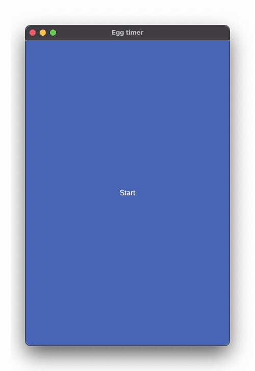
w.Option(app.Title("Egg timer"))
w.Option(app.Size(unit.Dp(400), unit.Dp(600)))
// ops are the operations from the UI
var ops op.Ops
// startButton is a clickable widget
var startButton widget.Clickable
// th defines the material design style
th := material.NewTheme()
// listen for events in the window.
for {
// first grab the event
evt := w.Event()
// then detect the type
switch typ := evt.(type) {
// this is sent when the application should re-render.
case app.FrameEvent:
gtx := app.NewContext(&ops, typ)
btn := material.Button(th, &startButton, "Start")
btn.Layout(gtx)
typ.Frame(gtx.Ops)
// and this is sent when the application should exits
case app.DestroyEvent:
os.Exit(0)
}
}
}()
app.Main()
}
Comments
-
From the top, we recognize the main function starting defining and calling the anonymous function.
-
We continue to define the window
w -
Three new variables are set
-
opsdefine the operations from the user interface -
startButtonis our button, a clickable widget. -
this the material theme.- Update in Gio 0.2 July 2023:
- Gio now defaults to system fonts. This is great, one less thing to remember. However, should you want to flex your font skills, read the July 2023 newsletter.
- Also you may want to learn about Go’s own dedicated high-quality True Type fonts? Read the fascinating blog and definetly visit Bigelow & Holmes, its creators. True old-school.
- Update in Gio 0.2 July 2023:
- The
forloop is more interesting.-
w.Event()blocks and waits for events. We store those asevt. -
Later we look at it’s type using
typ:= evt.(type)But note how there’s also aswitchhere. That’s pretty neat, and known as a type switch, allowing us to take different actions depending on thetypeof event that’s being processed.
-
-
In our case, we’re especially interested if the event is a
app.FrameEvent. If so:-
We define a new graphical context, or
gtx. It receives the pointer toopsas well as the event -
btnis declared as the actual button, with themeth, and a pointer to thestartButtonwidget. We also define the text that is displayed (note how the text is purely a something that is displayed on the button, not part of the stateful widget the button actually is.) -
Look here now. The button
btnis asked to lay itself out on the contextgtx. This is key. The layout doesn’t layout the button, the button lays itself out. This is very handy. Try for example to resize the window. No stress, the button just lays itself out again, no matter size or shape of the canvas. -
Notice how we got all the mouseover and the click-animation for free. They’re all part of the theme. That’s pretty nice!
-
We finalize by actually sending the operations
opsfrom the contextgtxto the FrameEvente.
-
-
To ensure a clean exit we also listen for the
app.DestroyEventwhich is sent when the app exits.- If so call os.Exit() to ensure and orderly end to the program. The convention is that zero indicates success, later logic can be added to send other values. This also requires the
osimport.
- If so call os.Exit() to ensure and orderly end to the program. The convention is that zero indicates success, later logic can be added to send other values. This also requires the
- Finally we call
app.Main(). Don’t forget.
Phew, that’s a long one. Thanks if you’re still along. We can summarize the news in this chapter in these three lines:
  gtx := app.NewContext(&ops, e)
  btn := material.Button(th, &startButton, "Start")
  btn.Layout(gtx)
If you’re comfortable with those, you’re good.