Chapter 6 - Low button with margin
Updated to Gio 0.8.0 as of April 4th 2025
Goals
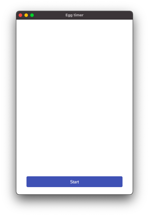
The intent of this chapter is to add open space around all sides of the button.

Outline
After looking at the whole code when refactoring in the last section, this time we only zoom in on the lines that change. Again, the action is happening within layout.Flex
Code - Overall structure
To highlight the structure, it can be useful to strip away some of the details There are really only three key lines here:
- Define margins using
layout.Inset - Lay out those margins
- Create button within those margins
layout.Flex{
    // ...
}.Layout(gtx,
    layout.Rigid(
        func(gtx C) D {
            // ONE: First define margins around the button using layout.Inset ...
            margins := layout.Inset{
                // ...
            }

            // TWO: ... then we lay out those margins ...
            margins.Layout(

                // THREE: ... and finally within the margins, we define and lay out the button
                func(gtx C) D {
                    btn := material.Button(th, &startButton, "Start")
                    return btn.Layout(gtx)
                },

            )

            }
        }
    )
)
Comments
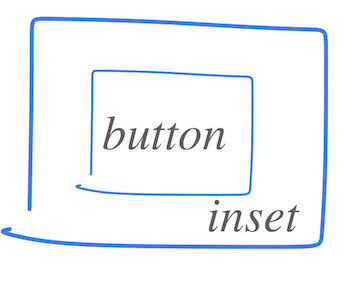
The above is like a donut with a button in the center. Some metaphors are useful, remember?

The margins are made using layout.Inset{ }. It’s a struct and defines the space around the widget:
margins := layout.Inset{
    Top:    unit.Dp(25),
    Bottom: unit.Dp(25),
    Right:  unit.Dp(35),
    Left:   unit.Dp(35),
}
Here, margins are given as Device independent pixels, unit.Dp. In case you want the same margin on all sides, there also exists a handy UniformInset( ), saving you a few keystrokes.
Code - details
To wrap it all up, here’s the code for the whole app.FrameEvent
case app.FrameEvent:
    gtx := app.NewContext(&ops, e)
    // Let's try out the flexbox layout concept
    layout.Flex{
        // Vertical alignment, from top to bottom
        Axis: layout.Vertical,
        // Empty space is left at the start, i.e. at the top
        Spacing: layout.SpaceStart,
    }.Layout(gtx,
        layout.Rigid(
            func(gtx C) D {
                // ONE: First define margins around the button using layout.Inset ...
                margins := layout.Inset{
                    Top:    unit.Dp(25),
                    Bottom: unit.Dp(25),
                    Right:  unit.Dp(35),
                    Left:   unit.Dp(35),
                }
                // TWO: ... then we lay out those margins ...
                return margins.Layout(gtx,
                    // THREE: ... and finally within the margins, we ddefine and lay out the button
                    func(gtx C) D {
                        btn := material.Button(th, &startButton, "Start")
                        return btn.Layout(gtx)
                    },
                )
            },
        ),
    )
    e.Frame(gtx.Ops)