Chapter 4 - Low button
Updated to Gio 0.8.0 as of April 4th 2025
Goals
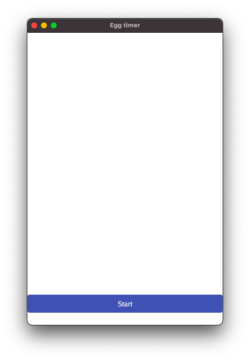
The button can’t fill the screen, obviously. So let’s move the button to the bottom. To do that we start using the layout concept known as Flexbox.
Outline
The last chapter was all about the overall structure of the program. Now we zoom into the system.FrameEvent and start using Flexbox. If it’s new to you, read up on it first, for example this one from Mozilla.
Overall structure
We don’t repeat the whole program here, but instead zoom in on the system.FrameEvent:
Code
We start by removing a lot of the details to better see the structure:
case system.FrameEvent:
layout.Flex{
// ...
}.Layout( // ...
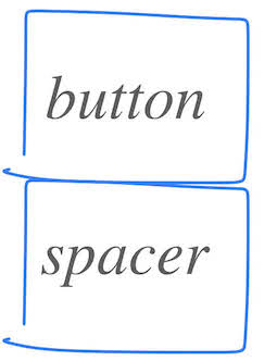
// We insert two rigid elements:
// First one to hold a button ...
layout.Rigid(),
// .. then one to hold an empty spacer
layout.Rigid(),
}
Comments
Let’s examine the structure of this code.
- First we define a
Flexboxthrough the structlayout.Flex{ } - Then we send it a list of children to be laid out through
Layout(gtx, ...). The graphical context, gtx, contains the constraints that the kids have to keep within, and any number of children can follow.
The children we list are both created by layout.Rigid( ): a. The first is a placeholder for the button, b. Then another is a placeholder to contain empty space below the button.
What’s a Rigid you ask? Simple - it’s job is to fill out the space it is given. Rigid children are laid out first, while Flexed children share what’s left. Apart from that, children are positioned in the order they are defined.
Constraint and Dimensions
At this point it serves us well take one step back and look at the concept that binds all this together, namely Constraints and Dimensions.
- Constraints are the Minimum and Maximum size of a widget. How small or large can the widget be
- Dimensions are the actual size of a widget. How small or large is it actually
A parent sets Constraints, and a child responds with Dimensions. The parent creates a Widget and calls Layout(), and the widget responds with it´s own dimensions, effectively laying itself out. As in the real world, not all children are well behaved, and as any child can attest to, some constraints from Mom or Dad might feel unfair - so there are some nuances and negotiation needed. But for the most part, this is it. Constraints and Dimensions bind it all together.
As we see above, layout operations are recursive. A child can itself have children. A layout can itself contain a layout. This goes on, and you can build elaborate structures from simple components. Turtles all the way down.
Code in detail
OK, that was the high level. Now it’s time to dive deep. Let’s look at the whole of system.FrameEvent in detail:
Code
case app.FrameEvent:
    gtx := app.NewContext(&ops, typ)
    // Let's try out the flexbox layout:
    layout.Flex{
        // Vertical alignment, from top to bottom
        Axis: layout.Vertical,
        // Empty space is left at the start, i.e. at the top
        Spacing: layout.SpaceStart,
    }.Layout(gtx,
        // We insert two rigid elements:
        // First one to hold a button ...
        layout.Rigid(
            func(gtx layout.Context) layout.Dimensions {
                btn := material.Button(th, &startButton, "Start")
                return btn.Layout(gtx)
            },
        ),
        // ... then one to hold an empty spacer
        layout.Rigid(
            // The height of the spacer is 25 Device independent pixels
            layout.Spacer{Height: unit.Dp(25)}.Layout,
        ),
    )
    typ.Frame(gtx.Ops)
Comments
Inside layout.Flex{ } we define two characteristics:
- Axis: Vertical alignment means stuff will be be placed or below each other.
- Spacing: Leftover space will be at the start.
Since ordering plays a role, you might think of it as if widgets pop up from the bottom of the screen. The button arrives first, then the spacer comes from below and pushes the button one notch up. All metaphors are wrong, some are useful
Now let’s look at the two calls to layout.Rigid( ):
- Rigid accepts a Widget
- A Widget is simply something that returns it’s own Dimensions
- How this is done doesn’t really matter. Here are two very different ways: a. In the first Rigid we pass in a
func( )that returns Dimensions frombtn.Layout()a. In the second Rigid we create aSpacer{ }struct, call it’sLayoutmethod, which in turn gives us Dimensions - From the parent perspective, it doesn’t really matter. As long as the child returns Dimensions, we’re good.
This takes care of laying the widgets out. But what are the widgets really?
-
As the name implies,
material.Buttonis a Button based on material design, as we detailed in the last chapter. -
Spacer adds empty space, here defined by Height. Since we’ve defined the overall layout to be vertical, and excess space should come at the top, this falls to the bottom and the button lands on top of it. Hence some space is created, lifting the button a little from the bottom of the screen. Handy stuff.
Good work We’ve come a long way and have covered a lot of ground. Good work, and thank you for keeping at it. Let’s move on and continue by looking over the codebase in earnest.